
Sans Forgetica, a font designed to help students remember the text they read
Sans Forgetica – a font designed to help people remember the text they read
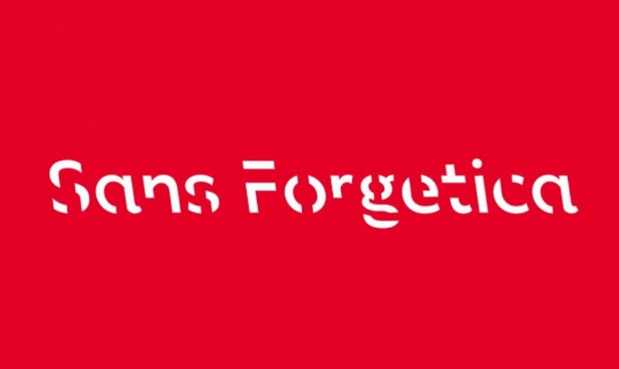
Sans Forgetica is a new font developed at RMIT University to help students learn. This is the world’s first font specifically designed to help people remember more information from the text they read.
Behind Sans Forgetica are designers and scientists from sciences, primarily specializing in behavioral sciences and typography. Principle, which rej they stuck to during the work was simple – Mind gymnastics leads to better memory.
– This wsp he collaboration led to the creation of a new font, which ry essentially sans forgetica differs from all others. It is also a clear application of theory to practice, something we strive for at RMIT – said Stephen Banham, a typography specialist at RMIT University in Melbourne.
Sans Forgetica was developed using the principle of learning (desirable difficulty), in which the rej an obstacle is added to the process requiring more effort from us. They are engaged in th deeper cognitive processes, kt re lead to better anchoring in memory.
Typical phonemes are familiar enough to leave no trace in memory. However, if the font is difficult enough to m zg cannot process it, this information is not retained. Researchers say Sans Forgetica is in the middle of the. It is difficult enough that you need more effort for it, and it is memorable.
– The text should be difficult to read, but not too difficult. The additional obstacle triggers memory more effectively. – explained Banham. Such obstacles are the gaps inside the letters. They cause that we do not immediately recognize the written word. – The mind will naturally seek to fill in these shapes , thus slowing down reading, but engaging memory – Banham added.
Sans Forgetica has tier of difficulty. This causes the reader to linger on each word for longer, giving m of the work to allow more time for deeper cognitive processing, in order to increase information retention.
The researchers tested the new font on about 400 RMIT students. During the test were checked fonts with tion of difficulty levels to determine which re of them led to the best memorization of the text being read. In a release issued after the tests, the researchers said „Sans Forgetica broke just enough design rules so that, without becoming too unreadable, it aids memorization”.
However, the results of the test are not as spectacular as researchers claim m ishing to talk about its font. The experiment showed a slight increase in the amount of memorized text written in Sans Forgetica – 57 percent., w por naniu to 50 percent. text written in Arial font.
Banham admitted that Sans Forgetica is best suited to kr tkich text. – I wouldn’t want novels to be printed in this font. Such a reading would likely result in b l heads – pointed out the scientist.